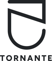
General use
Logo Hero
The default. Mark stacked above the wordmark — for print, signage, presentations and anywhere there's room to breathe.
01 Brand guidelines
For partners, press and clients who show our name next to theirs. Which logo to pick, how much room it needs, which colours and fonts belong to it — and where to download the files.
02 The logo
The mark is a single bent line — a hairpin bend, a tornante. Pick the version that fits the space; never build your own.
The default. Mark stacked above the wordmark — for print, signage, presentations and anywhere there's room to breathe.

For wide, low spaces: website headers, Google listings, email signatures, software and partner logo walls.

03 Clear space & size
x is the height of the letters in TORNANTE. Keep at least twice that free on every side — no text, edges or other logos.
Always resize from a corner, with the proportions locked.
Below these sizes the wordmark stops being readable.
Hero · 64 pxLandscape · 24 pxCircular · 16 px04 Backgrounds
The logo is always one solid colour. Use Ink on Sand and Off-white, white on Ink and on dark photography.


05 Please don't
Proportions are fixed.
The logo always sits level.
Ink or white only — no other colours.
No shadows, outlines, glows or gradients.
Don't place it faded or on busy, mid-tone grounds.
Never set the name in another font — always use the logo file.
07 Typography
Both are on Google Fonts, so anyone can install them at no cost.
Headlines and display text on the website and in presentations. One weight, used large, with slightly tight letter-spacing.
The typeface behind the wordmark. Regular and Bold — Bold in capitals with wide spacing for labels that sit next to the logo.
08 Downloads
SVG for print and web — it scales without losing quality. PNG for tools that don't accept SVG.
Need a format that isn't here, or not sure your use fits?